Riverdale Capital
Brand Identity
Riverdale Capital is a pioneering investment firm in New York City that needed a brand identity to communicate their commitment to integrity, their unwavering reliability, and their decades of experience and expertise. The challenge was to design a unique logo that would position them solidly in their sector and also differentiate them from their competitors.
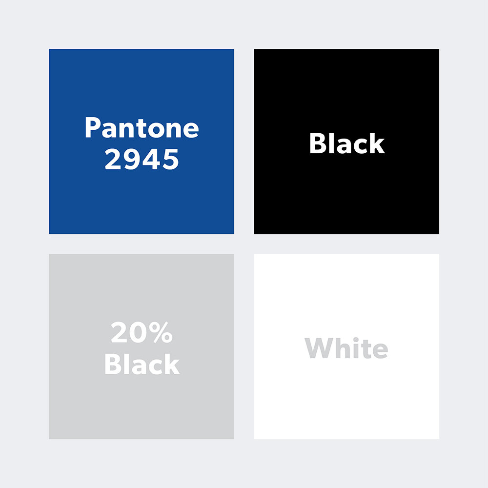
LT Design developed a complete brand identity program for Riverdale Capital. Drawing inspiration from the name of the firm, LT Design connected the power and strength of rivers with the ethos of Riverdale Capital. The river mark has a dynamic movement that communicates creativity and flexibility. The river flows upwards from the bottom left to the top right, which represents positive growth, forward movement, and is reminiscent of rising stock prices. The square around the mark creates a solid frame that communicates trust, stability, and security. The color blue symbolizes loyalty, wisdom, confidence, and intelligence. This strong and solid mark is memorable and legible at small and large scales.
LT Design selected the font Gibson for its distinct character and its elegant, solid lines. The logotype is both impressive and approachable.The logotype is set in all caps to communicate confidence and create a streamlined and unified mark. The logo is designed as a single color, which allows for maximum flexibility in applications and various mediums.
The project included development of a website that features drone video of the Riverdale neighborhood in New York City and the majestic Hudson River.


